A child window, commonly referred to as a control, is a pre-defined window that exists within and depends on a parent window. Controls reduce repetitive development tasks and provide a consistent and familiar user interface. A child control processes its own mouse and keyboard input and notifies its parent window of significant events by sending notification messages, typically through the WM_COMMAND message (or, for some common controls, the WM_NOTIFY message).
Child controls are created using the CreateWindow() or CreateWindowEx() function by specifying one of the predefined window class names, such as "BUTTON" or "EDIT". Windows provides more than twenty types of controls. Six of these, known as the classic controls, are built into the operating system and are available without requiring additional libraries.
Edit Control
An edit control, also known as a text box, allows the user to enter and edit text. The text within an edit control can be left-aligned, centred, or right-aligned. By default, an edit control accepts a single line of text, but it can also be created as a multiline control.
A standard edit control is limited to approximately 64 KB of text. Applications that need to store or edit larger amounts of formatted text can use a Rich Edit control, which is provided by the Windows Rich Edit library.
The predefined window class name used when creating an edit control with the CreateWindow() or CreateWindowEx() function is "EDIT".
Example
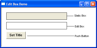
In the following, the user can enter a limited amount of text into the edit box. Clicking the button title ‘set title’ copies Editbox contents to the static box.
Static Control
A static control is commonly used to display labels, instructions, or other information associated with nearby controls. A standard static control cannot receive the keyboard focus and does not normally accept keyboard or mouse input. Unlike most interactive controls, it does not normally send WM_COMMAND notification messages to its parent window.
A static control can display text, simple graphics, icons, bitmaps, or frames. It is created by specifying "STATIC" as the window class name when calling the CreateWindow() or CreateWindowEx() function.
For an overview of creating and configuring a static control, refer to the Edit Control example above.
Buttons
A button is a control that allows the user to initiate an action. When the user clicks a button, it typically sends a WM_COMMAND notification message to its parent window.
A push button also known as a command button, is a rectangular control that typically displays a text label describing its function. Common examples include the OK and Cancel buttons found in Windows dialog boxes. Push buttons are created by specifying "BUTTON" as the window class name when calling the CreateWindow() or CreateWindowEx() function. For an overview of creating and configuring a button control, refer to the Edit Control example above.
A check box consists of a small square box accompanied by a descriptive label. Check boxes allow users to select or clear independent options and therefore function as toggle controls. Clicking a check box once displays a check mark, while clicking it again removes the check mark. Each change in state generates a notification message to the parent window.
A check box is created using the "BUTTON" window class with the BS_CHECKBOX (or BS_AUTOCHECKBOX) style specified in the dwStyle parameter of the CreateWindow() or CreateWindowEx() function.
Example
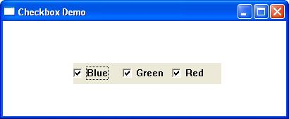
In the example below, clicking any checkboxes changes the window’s background to a mixture of the corresponding checkbox colour.
A radio button allows the user to select one option from a group of mutually exclusive choices. Each radio button consists of a small circular button and a descriptive label. Radio buttons are normally arranged in groups, and selecting one button automatically clears the previously selected button in the same group. Unlike check boxes, radio buttons are not toggle controls.
A radio button is created using the "BUTTON" window class with the BS_AUTORADIOBUTTON style specified in the dwStyle parameter of the CreateWindow() or CreateWindowEx() function.
Example
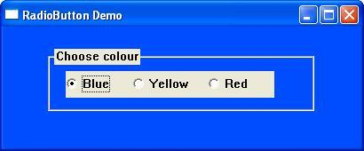
In the example below, clicking any radiobutton changes the window’s background to the corresponding radiobutton colour.
The Scrollbar
A scroll bar is a control that allows the user to navigate through content or adjust a value by moving horizontally (left and right) or vertically (up and down). It is commonly used when the content within a window or view is larger than the available display area.
A scroll bar consists of a long bar with a button at each end and a movable box called the thumb. The thumb indicates the current scroll position and can be dragged to move through the content. Its size often reflects the proportion of the visible content relative to the total scrollable area.
Scroll bars can either be built into a window or created as separate controls.
The predefined window class for a scroll bar is SCROLLBAR. To add scroll bars to an existing window, include the WS_HSCROLL (horizontal scroll bar) and/or WS_VSCROLL (vertical scroll bar) styles in the dwStyle parameter when calling the CreateWindow function.
Example
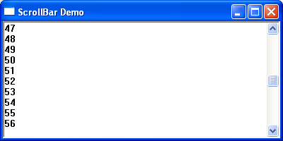
The following short program demonstrates the main window’s vertical scrollbar by displaying the scroll value within the main window.
The Listbox Control
A list box displays a collection of items in a scrollable rectangular area. It allows users to select one or more items from the list, depending on how the control is configured. Users make selections by clicking the desired item or items.
If the number of items exceeds the available display area, the list box automatically provides a scroll bar, allowing the user to view the remaining items.
The predefined window class for a list box is LISTBOX.
Example
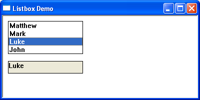
The following short program creates a list box and then adds a limited number of selectable items. Clicking any list item results in the selected listview value being copied to the static box.
A Combo Box Control
Combo Boxes
A combo box (also known as a drop-down list) combines the features of an edit box and a list box. It allows users to either type a value directly into the edit field or select an item from the drop-down list, depending on the style of the control.
Windows provides three types of combo boxes:
- Simple – Displays the list box and edit box at all times.
- Drop-down – Displays an edit box with a drop-down list that appears when the user clicks the arrow button.
- Drop-down List – Displays only the selected item and the drop-down list. Users can select an item from the list but cannot type their own value.
The predefined window class for a combo box is COMBOBOX.
Example
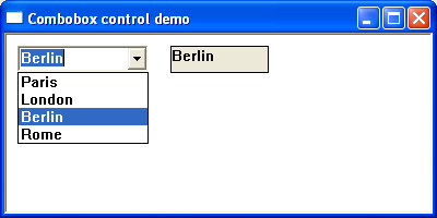
The following short program creates a dropdown list and then adds a limited number of selectable items. Selecting any list item results in the selected value being copied to the static box.