In addition to the standard controls, Windows provides an extended set of child controls known as common controls. These controls provide more advanced functionality than the standard controls and include controls such as tree views, list views, tab controls, progress bars, animation controls, and ComboBoxEx controls.
To use common controls in an MFC application, the header file afxcmn.h should be included. This header file automatically includes commctrl.h, which defines the Windows Common Controls API.
Older versions of MFC, such as Visual C++ 6.0, require the Common Controls library to be initialised before these controls can be created. This is normally achieved by calling the API function InitCommonControls() from the application’s CWinApp::InitInstance() member function. Modern versions of Visual Studio typically initialise the common controls automatically, although InitCommonControlsEx() can still be used when an application needs to initialise specific classes of common controls.
The prototype for the InitCommonControlsEx() API function is
BOOL InitCommonControlsEx(const INITCOMMONCONTROLSEX* lpInitCtrls);
where
lpInitCtrls – Points to an INITCOMMONCONTROLSEX structure that specifies which classes of common controls should be registered.
The function returns TRUE if the requested control classes were successfully initialised; otherwise, it returns FALSE.
The INITCOMMONCONTROLSEX structure is defined as follows:
typedef struct tagINITCOMMONCONTROLSEX{
    DWORD dwSize;
    DWORD dwICC;
} INITCOMMONCONTROLSEX, *LPINITCOMMONCONTROLSEX;
where
- dwSize – Specifies the size of the structure, in bytes.
- dwICC – Specifies which classes of common controls are to be initialised. One or more
ICC_flags can be combined using the bitwise OR (|) operator.
The following example initialises the standard Windows 95 common control classes:
INITCOMMONCONTROLSEX icc;
icc.dwSize = sizeof(INITCOMMONCONTROLSEX);
icc.dwICC = ICC_WIN95_CLASSES;
InitCommonControlsEx(&icc);
Note: When writing MFC applications with Visual C++ 6.0,
InitCommonControls()is sufficient for most applications and examples.InitCommonControlsEx()provides finer control over which common control classes are initialised and is the preferred function for modern Windows applications.
Common Controls List
Animation Control
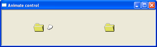
The CAnimateCtrl class encapsulates the Windows Animation common control. An animation control displays simple frame-based animations stored in AVI (Audio Video Interleave) files. Unlike a media player, the control is intended only for short, silent animations and does not support sound playback or modern video formats such as MPEG or MP4.
Animation controls are commonly used to provide visual feedback while an application performs a lengthy operation. Typical examples include displaying a moving file, a magnifying glass, or another animated symbol while searching, copying files, or processing data. The animations supplied with Windows are often referred to as AVI clips and consist of a sequence of bitmap frames displayed in rapid succession.
Animation controls are particularly useful for indicating that an operation is in progress without requiring the application to implement its own animation routines. Although they were widely used in earlier versions of Windows, modern applications often replace AVI animations with animated images, progress indicators, or custom graphical effects. Nevertheless, the CAnimateCtrl class remains a simple and effective way of displaying lightweight animations in traditional Windows applications.
The animation control does not play AVI files like a full media player. Instead, it is intended for short, repetitive animations that provide status information or improve the user interface.
For further reading – https://docs.microsoft.com/en-us/windows/win32/controls/animation-control-reference
The following example demonstrates the flying folder avi animation
ComboBoxEx Control
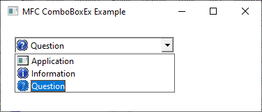
The ComboBoxEx control is an extended version of the standard Windows combo box control. It provides all the norThe CComboBoxEx class encapsulates the Windows ComboBoxEx common control. A ComboBoxEx extends the standard combo box by allowing each list item to be displayed with an associated image, selected image, and indentation level. This enables applications to present information in a more visually appealing and organised manner than is possible with a standard CComboBox.
Like a standard combo box, a ComboBoxEx combines an edit control with a drop-down list, allowing the user to select an item from a predefined list or, depending on the control style, enter a value directly. The additional image support makes the control particularly useful for displaying objects such as files, folders, drives, printers, or other items that benefit from graphical identification.
Before items containing images can be added to a ComboBoxEx control, an image list must first be created and associated with the control using the SetImageList() member function. Individual items are then inserted using the InsertItem() member function and described using a COMBOBOXEXITEM structure. This structure specifies the item’s text, image index, selected image, indentation level, and other optional attributes.mal features of a combo box while adding additional functionality, most notably native support for images associated with list items.
Unlike a standard combo box, where each item consists only of text, a ComboBoxEx control allows each item in the drop-down list to contain:
- A text label.
- An image displayed beside the text.
- A selected image that can be shown when the item is chosen.
The images are normally stored in an image list (HIMAGELIST) and are associated with individual items using the ComboBoxEx item structure.
For further reading https://docs.microsoft.com/en-us/windows/win32/controls/comboboxex-control-reference
The following example creates a comboboxex control with 3 items. Each item has an associated system bitmap image.
Date and Time Picker
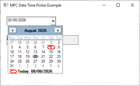
The CDateTimeCtrl class encapsulates the Windows Date and Time Picker common control. A date and time picker allows the user to select or edit a date, a time, or both, using either the keyboard or a drop-down calendar. The control provides a convenient alternative to entering dates manually, reducing the likelihood of invalid or incorrectly formatted input.
The appearance of the control is determined by the window style specified when it is created. It can display the current date and time, a date only, a time only, or present a drop-down month calendar from which the user can select a date. The display format can also be customised to present dates and times in a variety of regional or application-specific formats.
When the user changes the selected date or time, the control sends a notification message to its parent window, allowing the application to respond immediately to the new selection. The selected value can also be retrieved at any time using the GetTime() member function.
For further reading https://docs.microsoft.com/en-us/windows/win32/controls/date-and-time-picker-control-reference
The following short program demonstrates the date-picker control. Changing the date or time causes the static box to be updated with the selected date.
Header Control
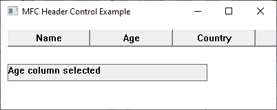
The CHeaderCtrl class encapsulates the Windows Header common control. A header control displays one or more column headings, each of which can contain text, an image, or both. Header controls are most commonly used in conjunction with list view controls to identify the contents of each column, although they can also be used independently wherever labelled columns are required.
Each column, known as a header item, is described by an HDITEM structure that specifies properties such as the displayed text, column width, alignment, image, and formatting options. Header items can be inserted, deleted, resized, and modified while the application is running.
A header control sends notification messages to its parent window whenever the user interacts with one of its items. These notifications include events such as clicking a column, double-clicking a column divider, beginning a resize operation, and changing the display order of columns. Applications typically respond to these notifications by sorting data, resizing columns, or updating the display.
For further reading https://docs.microsoft.com/en-us/windows/win32/controls/header-control-reference
The following short program creates a simple window with 3 header controls. Clicking either will cause the title to be display in a static box.
Hot Key
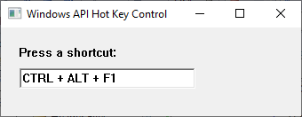
The CHotKeyCtrl class encapsulates the Windows Hot Key common control. A hot key control allows the user to define a keyboard shortcut by pressing a combination of keys directly into the control. The control automatically interprets the key combination and displays it in a standard Windows format, making it easy for users to assign or modify keyboard shortcuts within an application.
A hot key consists of a virtual key code combined with one or more modifier keys such as Ctrl, Alt, Shift, or the Windows key. The control validates the key combination as it is entered and can restrict invalid or undesirable combinations through application-defined rules.
The selected hot key can be retrieved programmatically and stored for later use. Applications commonly register the selected key combination using the Windows RegisterHotKey() API function, allowing the shortcut to invoke commands even when the application window is not active.
Unlike a standard edit control, a hot key control does not accept arbitrary text input. Instead, it captures keyboard input and automatically formats the pressed key combination using the standard Windows notation, for example Ctrl+Alt+S or Shift+F5.
IP Address Control
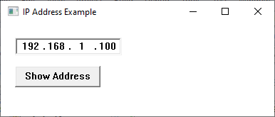
The CIPAddressCtrl class encapsulates the Windows IP Address common control. It provides a specialised edit control for entering and displaying IPv4 addresses in the familiar dotted-decimal format.
Unlike a standard edit control, the IP Address control automatically divides the address into four separate numeric fields called octets. Each field accepts values only in the range 0 to 255, preventing invalid IP addresses from being entered. The control automatically moves the keyboard focus between fields as the user types, making address entry quick and intuitive.
Applications typically use the control wherever users must enter IP addresses, such as network configuration utilities, communication programs, router setup software, and server management tools.
The control validates each field as the user types, ensuring that only valid numeric values are entered. When the application needs the address, it simply retrieves the four octets and combines them into a single IP address.
Note: The IP Address control is not available through the MFC CIPAddressCtrl class in Visual C++ 6.0. The underlying Windows IP Address common control is available, but it must be created and accessed directly using the Windows API rather than through an MFC wrapper.
Listview
The CListCtrl class encapsulates the Windows List View common control. A list view displays a collection of items in a variety of layouts, allowing the user to select, sort, and manipulate data. Unlike a standard list box, a list view can display multiple columns, icons, and additional information associated with each item.
A list view control supports four display styles: icon view, small icon view, list view, and report view. Icon and small icon views display items as icons with descriptive text, list view presents items in a single column, while report view organises information into rows and columns similar to a spreadsheet. Report view is the most commonly used style and is particularly suited to displaying tabular data.
Items are inserted into the control using the InsertItem() member function. When operating in report view, additional column headings are created using the InsertColumn() member function, while supplementary information for each row is added using the SetItemText() member function. Images may also be associated with items by attaching an image list to the control.
A list view control sends notification messages to its parent window whenever the user interacts with the control. These notifications include events such as selecting an item, activating an item by double-clicking, editing a label, or clicking a column heading. Applications can respond to these notifications to update the user interface, display additional information, or sort the displayed data.
For further reading https://docs.microsoft.com/en-us/windows/win32/controls/list-view-control-reference
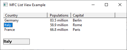
The following example creates a simple listview with 4 items. Changing the selected value will copy the contents of the first column into the static box
Month Calendar Control
The CMonthCalCtrl class encapsulates the Windows Month Calendar common control. A month calendar control displays one or more months in a calendar format, allowing the user to select dates using the mouse or keyboard. It provides an intuitive graphical interface for date selection and is commonly used in scheduling, diary, booking, and planning applications.
Unlike the Date and Time Picker control, which combines a text box with an optional drop-down calendar, the Month Calendar control always displays the calendar. This makes it particularly suitable where the user needs to browse and compare dates over an extended period.
The appearance and behaviour of the control can be customised using a variety of window styles. For example, applications can display multiple months, show week numbers, prevent the selection of invalid dates, or highlight the current date.
When the user changes the selected date, the control sends notification messages to its parent window. These notifications enable the application to respond immediately by updating other controls, displaying information for the selected date, or performing additional processing.
For further reading https://docs.microsoft.com/en-us/windows/win32/controls/month-calendar-control-reference
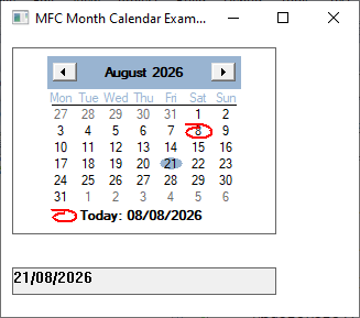
The following example creates a month calendar control and displays the currently selected date in a static label.
Pager Control
The
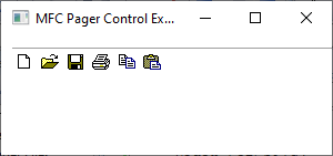
CPagerCtrlclass encapsulates the Windows Pager common control. A pager control provides a scrolling container for another child control when there is insufficient space to display the entire contents. Rather than displaying traditional scroll bars, the pager displays directional buttons that allow the user to scroll the contained control horizontally or vertically.The pager control does not display data itself. Instead, it acts as a container for another child control, such as a toolbar, rebar, or other window. As the user clicks the pager’s navigation buttons, different portions of the child control are brought into view.
A pager control sends notification messages to its parent window whenever scrolling occurs or when the child control requires repositioning. Applications can respond to these notifications by adjusting the displayed content or updating the user interface.
Compatibility
This example requires MFC 7.0 (Visual Studio .NET 2002) or later. TheCPagerCtrlclass is not available in the MFC library supplied with Visual C++ 6.0 and earlier versions. Readers using VC6 will need to create the underlying Windows Pager control (SysPager) manually using the Win32 API, as no MFC wrapper class is provided.
The following example creates a pager control that hosts a toolbar containing several standard system buttons. When the window is resized, the pager automatically provides scrolling so that all toolbar buttons remain accessible.
For further reading https://docs.microsoft.com/en-us/windows/win32/controls/pager-control-reference
In the following example, a page controller encloses the toolbar.
Progress Bar
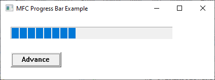
The CProgressCtrl class encapsulates the Windows Progress Bar common control. A progress bar provides a graphical indication of the progress of a lengthy operation by displaying a bar that gradually fills as the task advances. Progress bars are commonly used to indicate the status of operations such as file copying, software installation, data processing, and downloads.
A progress bar operates over a specified range of values, typically from 0 to 100. As the current position increases, a larger proportion of the bar is filled, giving the user a visual indication of how much of the operation has been completed. The control can be updated periodically as work progresses or incremented automatically by a fixed amount.
The appearance and behaviour of the progress bar can be customised using a variety of window styles. For example, the control may be displayed horizontally or vertically, and newer versions of Windows support additional features such as smooth filling and marquee animations.
Unlike many other common controls, a progress bar does not normally generate notification messages in response to user interaction, since it is intended to display information rather than accept input. Instead, the application updates the control programmatically as the associated task progresses.
For further reading https://docs.microsoft.com/en-us/windows/win32/controls/create-progress-bar-controls
In the example below, a timer function increments a progress bar control.
Rebar Control
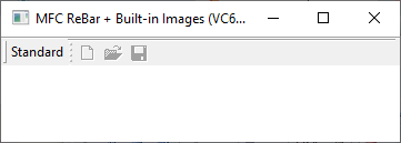
The CReBar class encapsulates the Windows Rebar common control. A rebar acts as a container for one or more child controls, known as bands, which can be arranged horizontally or vertically within the window. Each band typically contains a toolbar, combo box, edit control, or another child window. Users can reposition, resize, or hide individual bands, allowing the application’s user interface to be customised.
Unlike a toolbar, which contains only buttons, a rebar can host many different types of controls simultaneously. This flexibility makes rebars particularly useful for creating sophisticated user interfaces similar to those found in Microsoft Office and Windows Explorer.
Before a control can be displayed within a rebar, it must first be created as a child window. The control is then inserted into the rebar using the AddBar() member function or by supplying a REBARBANDINFO structure that describes the band’s properties, including its size, style, and caption.
A rebar control sends notification messages to its parent window whenever a band is resized, repositioned, or otherwise modified. Applications can respond to these notifications to update the user interface or save the user’s preferred layout.
Rebars are commonly used to create customisable toolbars similar to those found in Microsoft Office and Windows Explorer.
For further reading https://docs.microsoft.com/en-us/windows/win32/controls/rebar-controls
The following example creates a rebar containing a toolbar with standard system toolbar buttons.
Rich Edit Control
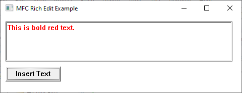
The CRichEditCtrl class encapsulates the Windows Rich Edit control. A Rich Edit control extends the functionality of the standard edit control by supporting formatted text, multiple fonts, colours, paragraph alignment, tab stops, and embedded objects. It also provides advanced editing features such as undo, redo, clipboard operations, text selection, and word wrapping.
Unlike the standard CEdit control, which stores plain text only, a Rich Edit control allows different portions of a document to have different formatting attributes. For example, individual words may be displayed in different fonts, sizes, colours, or styles such as bold, italic, and underline.
A Rich Edit control sends notification messages to its parent window whenever its contents or state changes. These notifications include events such as text modification, changes to the current selection, scrolling, and clipboard operations. Applications can respond to these notifications to update menus, toolbars, or other parts of the user interface.
For further reading https://docs.microsoft.com/en-us/windows/win32/controls/rich-edit-controls
The following example creates a Rich Edit control and a button. Clicking the button inserts a line of coloured, bold text into the control.
Status Bar
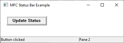
The CStatusBar class encapsulates the Windows Status Bar control. A status bar is typically displayed along the bottom edge of an application’s main window and is used to present status information, contextual help, progress information, or the current state of the application. Unlike a message box or dialog, a status bar provides continuous feedback without interrupting the user’s work.
A status bar is divided into one or more sections, known as panes. Each pane can display text, an icon, or another indicator. Applications commonly use different panes to display information such as the current document status, cursor position, keyboard state, or the current date and time.
Before a status bar can be displayed, it must be created using the Create() member function and configured with one or more panes using the SetIndicators() member function. The contents of each pane can then be updated at any time using the appropriate member functions.
Unlike many other controls, a status bar generally does not receive direct input from the user. Instead, it is updated programmatically by the application to reflect changes in its current state. For example, an application may display messages such as Ready, Loading file…, or Saving document…, or provide context-sensitive help describing the function of the currently selected menu item or toolbar button.
For further reading https://docs.microsoft.com/en-us/windows/win32/controls/status-bar-reference
The following example creates a status bar with two panes. Clicking the button updates the text displayed in the first pane.
Tab Control
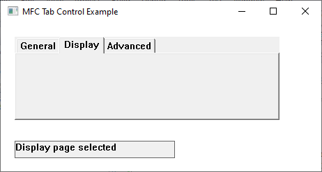
The CTabCtrl class encapsulates the Windows Tab common control. A tab control provides a series of labelled tabs that allow the user to switch between different pages of related information within the same window. Each tab typically represents a separate page containing its own controls or view, enabling large amounts of information to be organised without requiring multiple windows.
A tab control displays only the tab headings. It is the responsibility of the application to create, show, and hide the child windows associated with each tab when the user changes the current selection. In MFC, tab controls are frequently used to implement property sheets, configuration dialogs, and multi-page interfaces.
Tabs are inserted using the InsertItem() member function, with each tab described by a TCITEM structure containing properties such as the tab text, image, and application-defined data. The currently selected tab can be obtained or changed using the appropriate member functions.
When the user selects a different tab, the control sends notification messages to its parent window. The most commonly used notifications are TCN_SELCHANGING, sent before the selection changes, and TCN_SELCHANGE, sent after a new tab has been selected. Applications typically respond by hiding the controls belonging to the previous page and displaying those associated with the newly selected tab.
For further reading https://docs.microsoft.com/en-us/windows/win32/controls/tab-control-reference
The following example creates a tab control containing three tabs. Selecting a tab updates a static label to indicate the currently selected page.
Toolbar Control
The CToolBar class encapsulates the Windows Toolbar common control. A toolbar provides a row or column of buttons that give users quick access to frequently used commands. Each button typically displays an icon, although text labels, separators, drop-down buttons, and check buttons may also be used. Toolbars provide an efficient alternative to selecting commands from application menus.
A toolbar is normally positioned along the top edge of the application’s main window, although it may also be docked to other sides of the window or allowed to float in a separate frame. Each toolbar button is associated with a command identifier, enabling the application to respond when the user clicks the button.
Toolbar buttons usually obtain their images from an image list or bitmap resource. MFC also supports loading predefined toolbar resources created using the Visual Studio resource editor. Modern versions of Windows additionally provide support for high-colour image lists and alpha-blended icons.
When the user clicks a toolbar button, the control sends the corresponding command message to its parent window. Applications respond to these command messages in the same way as menu selections, allowing a single command handler to service both toolbar buttons and menu items.
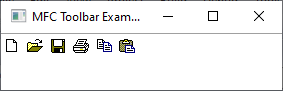
The following example creates a toolbar containing the standard Windows New, Open, Save, Print, Copy, and Paste buttons.
Tooltip
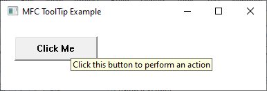
The CToolTipCtrl class encapsulates the Windows Tooltip common control. A tooltip is a small pop-up window that displays a brief description of a control or user interface element when the user positions the mouse pointer over it. Tooltips provide context-sensitive help without occupying permanent screen space, making them particularly useful for toolbar buttons and controls whose purpose may not be immediately obvious.
A tooltip control does not display information by itself. Instead, it is associated with one or more existing child controls using the AddTool() member function. When the mouse pointer remains over a registered control for a short period, the tooltip is displayed automatically. The displayed text can be specified when the tool is registered or updated later while the application is running.
Tooltips can be configured to appear automatically, remain visible for a specified period, or display using different visual styles depending on the version of Windows. Modern versions of Windows also support multiline tooltips, balloon tooltips, and hyperlinks.
Unlike many common controls, a tooltip does not normally receive direct user input. Instead, it monitors mouse movement over registered controls and displays the appropriate text when required. In many MFC applications, mouse messages are forwarded to the tooltip control by calling the RelayEvent() member function from the application’s PreTranslateMessage() function.
For further reading https://docs.microsoft.com/en-us/windows/win32/controls/tooltip-control-reference
The following example creates a push button and associates a tooltip with it.
Trackbar Control
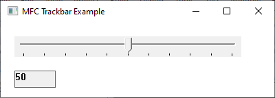
The CSliderCtrl class encapsulates the Windows Trackbar common control. A trackbar, also known as a slider control, allows the user to select a value from a continuous or fixed range by dragging a movable thumb along a horizontal or vertical track. Trackbars provide a simple and intuitive method of adjusting numeric values without requiring the user to type them.
A trackbar consists of a track, a movable thumb, and optional tick marks that indicate individual positions along the range. Applications typically use trackbars to adjust settings such as volume, brightness, colour intensity, zoom level, or animation speed. The control can be configured to display tick marks, selection ranges, and labels depending on the application’s requirements.
Before the control can be used, the application specifies the minimum and maximum values using the SetRange() member function. The current position can then be obtained or modified programmatically using the appropriate member functions.
When the user moves the slider, the control sends WM_HSCROLL or WM_VSCROLL messages to its parent window, depending on whether the control is horizontal or vertical. The application can respond to these messages by retrieving the current slider position and updating other controls or application settings accordingly.
For further reading – https://docs.microsoft.com/en-us/windows/win32/controls/using-trackbar-controls
The following example creates a horizontal trackbar with a range of 0 to 100. As the slider is moved, the current value is displayed in a static label.
Tree-View Control
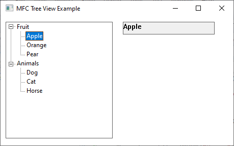
The CTreeCtrl class encapsulates the Windows Tree View common control. A tree view displays information in a hierarchical structure consisting of parent and child items. Each item may be expanded or collapsed to reveal or hide its subordinate items, making the control particularly suitable for displaying structured information such as directories, organisational charts, and document outlines.
Each item within a tree view is represented by an HTREEITEM handle and may contain text, an image, a selected image, and application-defined data. Images are typically supplied through an image list, allowing different icons to be displayed for folders, files, or other object types.
Items are inserted into the control using the InsertItem() member function. New items can be added as root items or as children of existing items, allowing the application to construct complex hierarchical structures dynamically. Items may also be removed, expanded, collapsed, or modified while the application is running.
When the user interacts with the control, the tree view sends notification messages to its parent window. These notifications include events such as selecting an item, expanding or collapsing a branch, editing a label, or beginning a drag-and-drop operation. Applications can respond to these notifications by displaying additional information, loading child items, or updating other parts of the user interface.
For further reading – https://docs.microsoft.com/en-us/windows/win32/controls/tree-view-control-reference
The following example creates a tree view containing several items. Selecting an item displays its text in a static label.
Updown Control
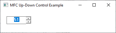
The CSpinButtonCtrl class encapsulates the Windows Up-Down common control. An up-down control, also known as a spin button control, consists of a pair of arrow buttons that allow the user to increment or decrement a numeric value. The control is commonly attached to an edit control, enabling users to either type a value directly or adjust it using the arrow buttons.
An up-down control maintains a range of valid values together with the current position. Each click of the up or down arrow changes the current value by one step, although applications may customise this behaviour if required. By restricting the range of acceptable values, the control helps prevent invalid numeric input.
The control can operate independently or be associated with a buddy window, typically an edit control. When a buddy control is assigned, the displayed value is updated automatically as the user operates the spin buttons, providing a convenient mechanism for entering small numeric values.
When the user clicks one of the spin buttons, the control sends notification messages to its parent window indicating that the current position is about to change. The application can respond to these notifications by validating the new value, preventing invalid changes, or updating other controls within the user interface.
For further reading https://docs.microsoft.com/en-us/windows/win32/controls/up-down-control-reference
The following example creates an edit control and an up-down control. Clicking the arrows changes the displayed value between 0 and 100.
.